Thursday, March 29, 2012
Alignment: Another Basic Principle of Design
Thursday, March 22, 2012
10 Reasons to have a Home Library
I keep hearing that the book is dead, dying at best, but I can't wrap my head around it. I love reading books on my phone as much as the next person, in fact, there are some books I prefer to read electronically. There is something about the small screen that makes you feel like you are whipping through those Russian Classics. While convenient, here are 10 reasons why electronic readers cannot replace the home library:
1. Social Discourse: Our home library serves as a conversation starter. Guests are not likely to flip through your e-reader, but they will peruse your shelves. Few topics are more enjoyable than mutual interest in literature.
2. Books are Beautiful: Many people use books as decoration. Real books (as opposed to faux-book blocks) bring personality and character to a room. Truly beautiful books make excellent collectors items or solo display pieces.
3. Personal Identity: A home library conveys the personality of the owner. In a library you collect the books that have been meaningful to you and the ideas that have shaped your personality. A library can be an excellent reminder to ourselves of what we value most.
4. Literacy Development: Before children reach the first grade, they need to have spent well over 1,000 hours engaged in reading activities. (Adams, Beginning to Read. MIT Press).While some of these activities will include games, Sesame Street, and bedtime stores, hours spent just looking through books are hugely beneficial as well.
5. Communicates Priority: Owning books communicates that you put a priority on reading. Whether your library contains literature, philosophy, self-help, or any other genre, the ownership of books is a statement on the importance of the pursuit of knowledge and the power of the written word.
6. Tangible Assets: This is one place where the physical book outreaches the e-book 100 to 1. While you own both a physical book and an e-book, you can only loan out or give away a physical book. E-books are confined to one device for one owner. If you choose to collect rare or valuable books, these can retain real value that can be leveraged, gifted, or handed down in a family.
7. Visual Reminder: We all have goals to read books, but often our busy lives get in the way. A home library is an ever present reminder of that goal. In some regards, building a personal library can be a labor in gaining knowledge, stretching ability, and cultivating a meaningful and well-rounded collection for the ages.
8. Reference: A home library can be an excellent reference point for business ventures, academic learning, hobbies, and any number of topics.
9. Remembrance: Family histories, journals, and important documents are an important part of a personal library. Loose documents can be difficult to store, but gorgeous, book-like boxes are an excellent solution.
10. Preservation: Perhaps the most relevant to this digital age is the issue of preservation. Now, more than ever, we can keep detailed records of every correspondence, picture, chat, or online interaction. While these interactions are easy to store, they are less accessible. Email is a trove of important and meaningful correspondence, but is only accessible to someone with the username and password. Binding these memories into a custom book makes an invaluable addition to your home library.
Saturday, March 10, 2012
How does repetition fit into design?
Repetition is consistency. It’s bringing one to three of the same elements into all of your designs to make it obvious to your viewer that the designs are 1) related, and 2) similar in purpose. These elements can be anything: colors, fonts, objects, etc.
Let’s return to Apple as our example. They have some of the best designs around. Go to their website: apple.com. Take a second to look at the home page. Notice the background and menu colors, the font styles of the featured product, and the hand interacting with the product (if you’re seeing the ad about the iPad2).
Now, click amongst the various tabs on the site. do you see these things repeated on each page? Let’s explore what they’re doing.
Every background is white.
Apple uses white in their TV ads, on their products, and on virtually every PR piece they’ve put out in the past decade. If they’re not using white, they’re using that grayish-silver.
Color attracts a lot of attention, even if the color is simply white. Colors carry associations to real life things like brands or events. Every debate in the presidential primaries, for instance, has a backdrop with the respective political party’s primary color: blue for the Republicans and red for the Democrats. Viewers who merely glance at the TV know immediately what party is debating based on the color of the set, not by the names of the people.
Color makes association easy. If you’re trying to brand a series of announcements, an event, or a company with your design, choose your color wisely and use it consistently.
Fonts are repeated.
Apple uses two main fonts for the things that you glance at quickly (ie. their ads). Their fonts consist of one simple, bold serif they use to advertise their products (iPod, iPad, ,iTunes, OS X Mountain Lion, etc), and another thinner font—that is more than likely of the same family—for all of their subtitles and catch phrases (“The new iPad,” “iCloud stores your…,” etc). The shape of the letters cue your mind to a product or description of their product. This happens all the time with a variety of simple and complex fonts. Don’t believe me?
 Harry Potter of course. Not a single capital “h” or “p” was used , and yet certain features of this font (aka the lighting shaped base of the “T”) help you remember the font of Harry Potter’s book and movie title almost at once. You can almost see this words coming out of the clouds toward you can’t you?
Each font is unique and easily recognizable to one who is familiar with it. Fonts are a powerful repetition tool. Pick one you won’t get tired of.
The Hand
Repetition is found in the form of a bodiless, generic hand they use to show you how to use their products. They picked a simple, consistent medium that doesn’t distract you with the image of a person. (Notice that even when they first introduced the iPod, you never saw the details of the people dancing with them, they were merely silhouettes against a solid color.) It’s obvious that a person, such as yourself, can play with this product just as easily as they could with the original iPod Classic.
Thus you can see the power of repetition. If you were to see an ad for any product with one of these three elements, you would likely be reminded of Apple in some way. If Swiffer mops were to imitate all three elements, they wouldn’t sell a single mop. The viewer would only be thinking “this ad is a rip off,” or “How can I get my hands on the new iPhone 4S.”
Thursday, March 1, 2012
Proximity: What does it have to do with design?
Proximity is a basic element of design that is essential to make it mean anything. The principle is something that we all understand and use in our day to day lives, and yet it can be one of the most easily overlooked skills when creating our designs. Sometimes some of our toughest problems can be solved by simply applying this principle.
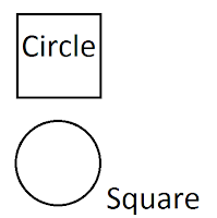
Proximity is easy enough to understand. It refers to how closely items are placed together on a page. For example:

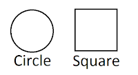
There is proximity at play here. Proximity is simply the measurement of “closeness” or “farness” objects are away from each other. There are 4 objects on this page: the circle, the square, and the words “circle” and “square” (Consider text to be just another “object”). These 4 objects are spaced at different intervals showing no real relationship to each other… This collection of words and shapes doesn’t mean anything to us. We might stretch our minds to see it as a piece of art, but the reality of it is, this picture shares no real purpose. Conversely, If we move things around and place certain objects closer to each other and separate others, you get this:

We look at this picture and the objects suddenly have meaning. The circle and square are labeled. The text is placed closely to the object it labels, letting us know that we can expect them to share something in common. You’ll notice too that there is more space between the dissimilar items than there is between the similar items. The human brain associates items in closer proximity to each other and separates them from objects that are farther away. The best designs utilize this fact. Look at how Apple did it.
They put an attractive, average person (someone who you consider yourself to be) right on top of the iphone, creating a relationship between you and the iphone. Now the iphone has meaning to you.
You’ll notice that we also use proximity in our grammar. Like words are placed together. Ex: The bright red bouncy ball. We put “bright” and “red” together in order to distinguish that “bright” has to do with “red,” not “bouncy.” On top of that, we carefully place ball at the end of the sentence to note that we’re describing it. Our words lose meaning when we write “ball red the bright bouncy.” Through proximity, we create a meaning and purpose for our words.
You expect like things to be grouped together, so does your audience. You want to take advantage of proximity in every design. Your goal is to share a message with your intended audience and proximity will help you do that.


