Proximity is a basic element of design that is essential to make it mean anything. The principle is something that we all understand and use in our day to day lives, and yet it can be one of the most easily overlooked skills when creating our designs. Sometimes some of our toughest problems can be solved by simply applying this principle.
Proximity is easy enough to understand. It refers to how closely items are placed together on a page. For example:

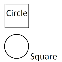
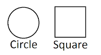
There is proximity at play here. Proximity is simply the measurement of “closeness” or “farness” objects are away from each other. There are 4 objects on this page: the circle, the square, and the words “circle” and “square” (Consider text to be just another “object”). These 4 objects are spaced at different intervals showing no real relationship to each other… This collection of words and shapes doesn’t mean anything to us. We might stretch our minds to see it as a piece of art, but the reality of it is, this picture shares no real purpose. Conversely, If we move things around and place certain objects closer to each other and separate others, you get this:

We look at this picture and the objects suddenly have meaning. The circle and square are labeled. The text is placed closely to the object it labels, letting us know that we can expect them to share something in common. You’ll notice too that there is more space between the dissimilar items than there is between the similar items. The human brain associates items in closer proximity to each other and separates them from objects that are farther away. The best designs utilize this fact. Look at how Apple did it.
They put an attractive, average person (someone who you consider yourself to be) right on top of the iphone, creating a relationship between you and the iphone. Now the iphone has meaning to you.
You’ll notice that we also use proximity in our grammar. Like words are placed together. Ex: The bright red bouncy ball. We put “bright” and “red” together in order to distinguish that “bright” has to do with “red,” not “bouncy.” On top of that, we carefully place ball at the end of the sentence to note that we’re describing it. Our words lose meaning when we write “ball red the bright bouncy.” Through proximity, we create a meaning and purpose for our words.
You expect like things to be grouped together, so does your audience. You want to take advantage of proximity in every design. Your goal is to share a message with your intended audience and proximity will help you do that.
No comments:
Post a Comment