Monday, February 27, 2012

Wake Up the World

We have been working on a really interesting project with the owner of Free-Men Companies, Eric McGuire.

Free-Men Companies is a financial planning organization with a strong foundation in civic responsiblitiy. McGuire has written and published his book, Wake Up the World: Prophetic Warnings and Our Duty to Protect Freedom and the Constitution of the United States. The book is a compilation of instruction from the Founding Fathers and LDS Church leaders regarding the constitution of the United States.


McGuire had a gorgeous cover for his paperback books
 We worked with the author to design a custom cover design for the leather bound edition of his book. All of the cover design is done by hand using a silk screen printing method. This allows us a lot of flexibility in the design and provides a unique affect that is hard to replicate with offset printing or machine stamping. After working with McGuire, we settled on a clean, elegant design.


Books with their new leather covers, laid out to be screen-printed.

The Free-Men logo was screen printed onto the back of each book

Books laid out to dry with the first coat of sealant.

Stacked books getting prepped for delivery.
 One of the best parts of the job is working with authors and being exposed to some of the amazing things being done and said by the individuals in our community.

For more information, or to contact Eric McGuire, send an email.

Wednesday, February 22, 2012

What is the difference between a Serif and a Sans Serif?

Hey guys! I’m the newest member of the KBeckBooks team. My name is Chris. I graduated from college with a Psychology major and an Editing minor in August of last year. Books and book publishing have become an integral part of my life since graduation, a hobby turned career you might say. I currently intern in the Acquisitions department at Cedar Fort Publishing and am employed as a copyeditor an electronic publishing business.

I have picked up a few tricks of the trade that I think anyone interested in book layout or publication should know before jumping in. I want to start sharing these ideas with you via blog. I cannot reveal the specific, internal workings of either publishing company, as that would be infringement on intellectual property. I will, however, share the knowledge I have gained that is considered basic knowledge in the publishing community. We’ll start with layout design, more specifically typefaces and their uses.

If you’re anything like me, you heard the terms “serif” and “sans serif” once in your high school English class, but can hardly remember what they are, let alone the difference between them. The terms didn’t stick out because they were seemingly insignificant. I’m sorry to break it to you, but they are more significant than you now realize. You are influenced by them every day. They’re carefully chosen by professionals because they affect the readability of your text. Choose the wrong typeface, and you’ve lost your audience’s attention. So let’s go over what each is and their pros and cons.

Serifs

Serifs are unique because they always have extra markings—called serifs—on the letters. For example, instead of drawing two straight lines up and down for the capital letter “H,” you’ll notice horizontal lines extending off the ends of each vertical line, as shown in the picture provided. That’s the only thing that separates a serif from a sans serif.

Pros: These lines are more reminiscent of genuine human handwriting. They make the text easier to read for long periods of time. They are perfect for the body text of any book or blog (like this one. Notice I am using the common serif Times New Roman for this text).

Cons: Serifs are much less attractive when blown up to attract attention. The little lines stick out too much and detract from reading the message intended, and as a title, sign, or billboard is designed to attract attention, you don’t want to use them for these means.

Sans Serifs

Sans means “without,” and seeing that “serif” means extra markings, I’m guessing you can figure out that Sans Serifs means without those extra markings. You’ll notice the difference in this picture of an H.

Pros: Without the markings, these letters are easier to read and attract attention to the message, not the typeface. They’re great for titles, signs, and billboards.

Cons: Human eyes get weary of reading them for longer periods of time. They are unsettling to our eyes and we need to take a break. If you’re writing a book, a serif font will cause your readers to put it down, rather than continue on through the night.

Those are the essentials you need to know regarding serifs and sans serifs. There are endless amounts of fonts for both typefaces, the trick is finding the one that matches your needs. It becomes a matter of personal preference and I, unfortunately, can’t teach you that. A great resource to look for new fonts is dafont.com.

Please leave comments on other places you have found that offer good fonts. Feel free to also make requests regarding subject matter that you would like me to blog about. Look for my next blog on the topic of proximity in layout design.

Saturday, December 3, 2011

The Library Phantom!

I stumbled across this incredible story on NPR. Apparently, a very talented book artist has been leaving "gifts" all over Edinburgh, Scotland. The exceptional sculptures are, in the words of the artist, "in support of libraries, books, words, ideas..."

I highly recommend that your read the original stories on NPR:
And the follow up: The Library Phantom Returns!

Here are a few of my favorites:


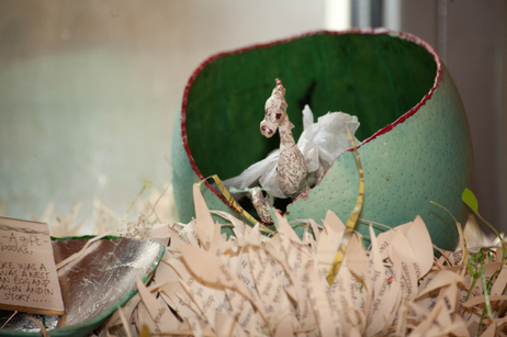
This tree takes my breath away and the eggs are lined with gold leaf.


"A gift in support of libraries, books, works, ideas... Once upon a time there was a book and in the book was a nest and in the nest was an egg and in the egg was a dragon and in the dragon was a story..."


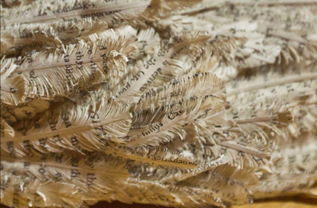
Yes, those feathers are made out of paper, book paper.


O loves this little T-Rex, the story shows his tail peeking out of the back of the book.

Saturday, November 12, 2011

SCORE

There are a lot of things I love about running my own business. Mostly, I love bookbinding and I love working with people. I do not love marketing.

Primarily, I think my distaste for marketing and advertising stems from a general lack of knowledge, experience, and well, success. As I was searching the BYU Library's databases for a book or article to help clear the haze, I stumbled across a link for SCORE. I am amazed by this incredible resource and cannot wait to start taking advantage of some of these services.

Here is the gist of it:

  • Free, online tutorials for small business owners and startups
  • Free, local training
  • Free mentoring with local business professionals (options to email with a mentor available as well)
  • Free access to templates and tools
  • Local networking groups
Also, this video is inspiring.


Monday, November 7, 2011

Now Benefitting the Center for Women and Children in Crisis

K.Beck books is proud to now benefit the Center for Women and Children in Crisis. With every book or journal purchased, we donate another to CWCIC.

So now to answer the questions, why this partnership?

First, a story. I was reading an article about a gal who teaches bookbinding classes and once a year she goes to Ethiopia to teach binding to lepers. I was amazed, and a little intimidated. I have always been impressed by small business owners who give a portion of their proceeds or otherwise benefit non-profit organizations. However, I always let myself off the hook. My excuses went something like this: "My business is too small"; "Bookbinding is more of a niche market"; "Maybe when I'm more established"; and on and on. But this girl, this girl is doing some good. Real good, with real people, with bookbinding.

So, I started looking around online at the local non-profits. The CWCIC caught my eye as their list of donated items included journals. It turns out, that in addition to the necessities, these women are in need of personal possessions. Many of the women and children at this center have given up everything. The more I thought about it, the more excited and motivated I became. It isn't much, but the idea of providing a leather bound volume of Fairy Tales to a mother and child at a shelter is enough to get you up in the morning.

Thanks to the CWCIC for letting me partner with you. Hopefully, K.Beck books can contribute to the good you're already doing in our community. (For more information, you can check out our website, or CWCIC.org.)

Happy kick-off to the Holiday Season!

-Kelcie Beck

Friday, November 4, 2011

Playing with Buttons

I'm doing a little bit of experimenting with shopping cart buttons. Bear with me for a moment...


Thursday, October 27, 2011

New Site!

After nearly 2 years in business, K. Beck books is launching a new site!

We have learned a lot over the last few months and years of working with you to meet individual, custom orders, as well as large, wholesale orders. Taking the collective experience of our successes, failures, and just the day in day out of operation, we have put together a new business model and a new site to better meet your needs.

I'm excited about where we're going and can't wait to launch the new site. In the meantime, here's a clip of what's to come...